Glue Home
Glue enables smart access for people, products and services into the home while you are away.

Overview
Glue enables smart access for people, products and services into the home while you are away. When I joined Glue back in Feb 2019, the Company was moving away from an agency built product to an in house built product. A lot of code refactoring took place and an there was a keen appetite to rethink the home screen.
With one of the most beautiful smart locks on the market, but a UI that was comparatively outdated, it was time to build a cohesive product experience. I’m incredibly proud of what we’ve done so far as a team and I look forward to seeing how far we can take the product.
The Problem
Other than a general UI refresh, some business requests, a desire to modernize the app, there were a few problems that our users continued to face.
- People were accidentally unlocking their door from their pocket.
- Increase awareness of InHome.
- People were accidentally unlocking the wrong property.
- Feedback. Users were unsure of a successful lock or unlock or when they had successfully completed other tasks.
All of the above are inconvenient problems, however, I really believe that performance elicits trust. If we can’t provide a reliable service or we make it too easy for people to make mistakes, everything else we try to achieve later on down the line can be forgotten. It’s so important we make people feel safe and secure in trusting us with their front door to their home.
Learnings
At Glue we’re incredibly fortunate that we have a lot of loyal customers willing to provide feedback and jump on a call whenever needed. After looking at the data, customer surveys, and interviewing customers one-on-one, it was evident that the same problems continued to frustrate our customers.
Our original app did a bad job of educating the person on what InHome was and how it worked, it was a business requirement that we started to slowly educate our user to prepare them for more services and integrations.
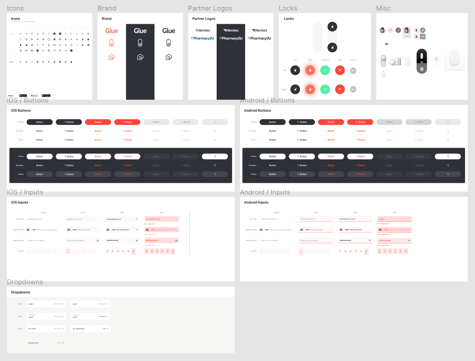
As well as designing the new app, I started creating a style guide that allowed me to stay consistent throughout.

The Solution
This is an ongoing project and is still a work in progress. However, I strongly believe that in a short period of time we’ve been able to create a more reliable, cohesive and trustworthy experience. Version 2.8 is the first step in this direction and we’re projected to have a more complete experience available towards the end of October.

Task at hand.
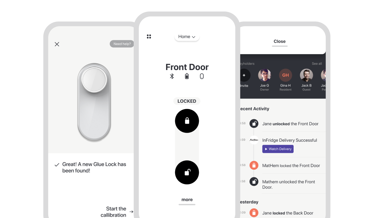
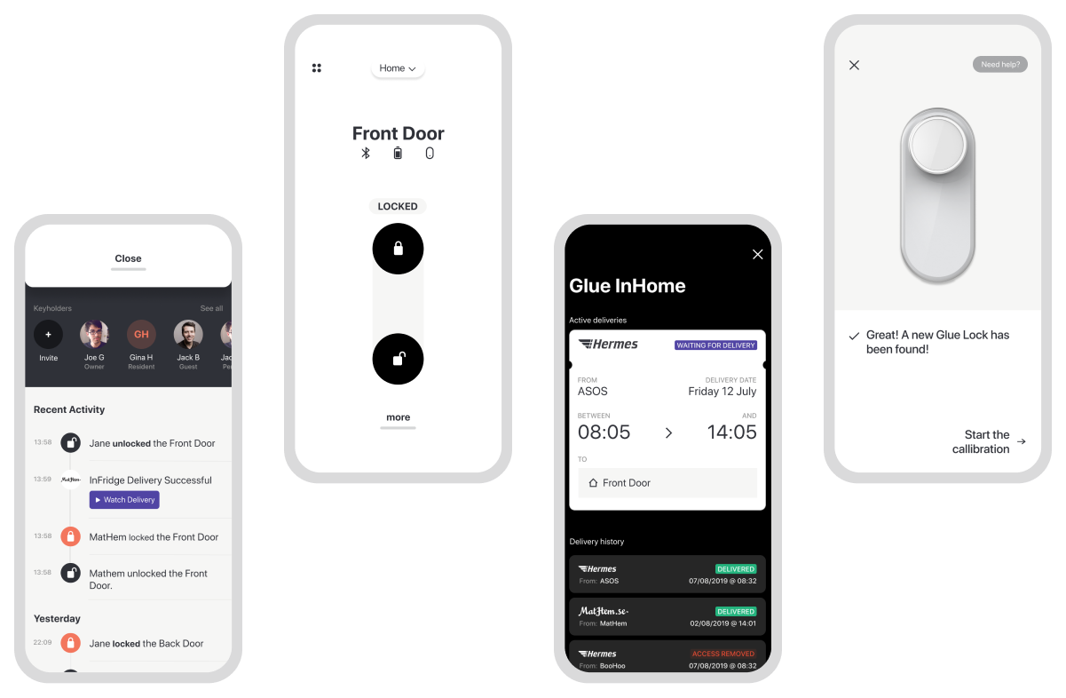
99% of users were coming to the app to unlock & lock. Using contrast we were able to focus the user on the task at hand. The lock buttons achieved a contrast ratio of 12.98:1. We even introduced haptics and sounds to provide more comprehensive feedback.
We used Lottie for the locking and unlocking animations.
InHome Deliveries
Glue is so much more than just a smart lock. Our lock allows users to accept deliveries into the home, food into the fridge and services, all whilst you’re away. We wanted to increase awareness and educate the user on what InHome was.
No more mistakes.
The original app allowed you to swipe between properties and sometimes you would accidentally swipe and unlock the wrong property. I made switching harder to do but easily accessible.
New on-boarding
With an increasingly established style guide, I was able to create a new, more efficient, onboarding experience with ease. I used Principle for the prototype. I had a lot of fun with the interaction design.
