
Browz
Browz all your favourite brands in one place. It's like Tinder for clothes.
Overview
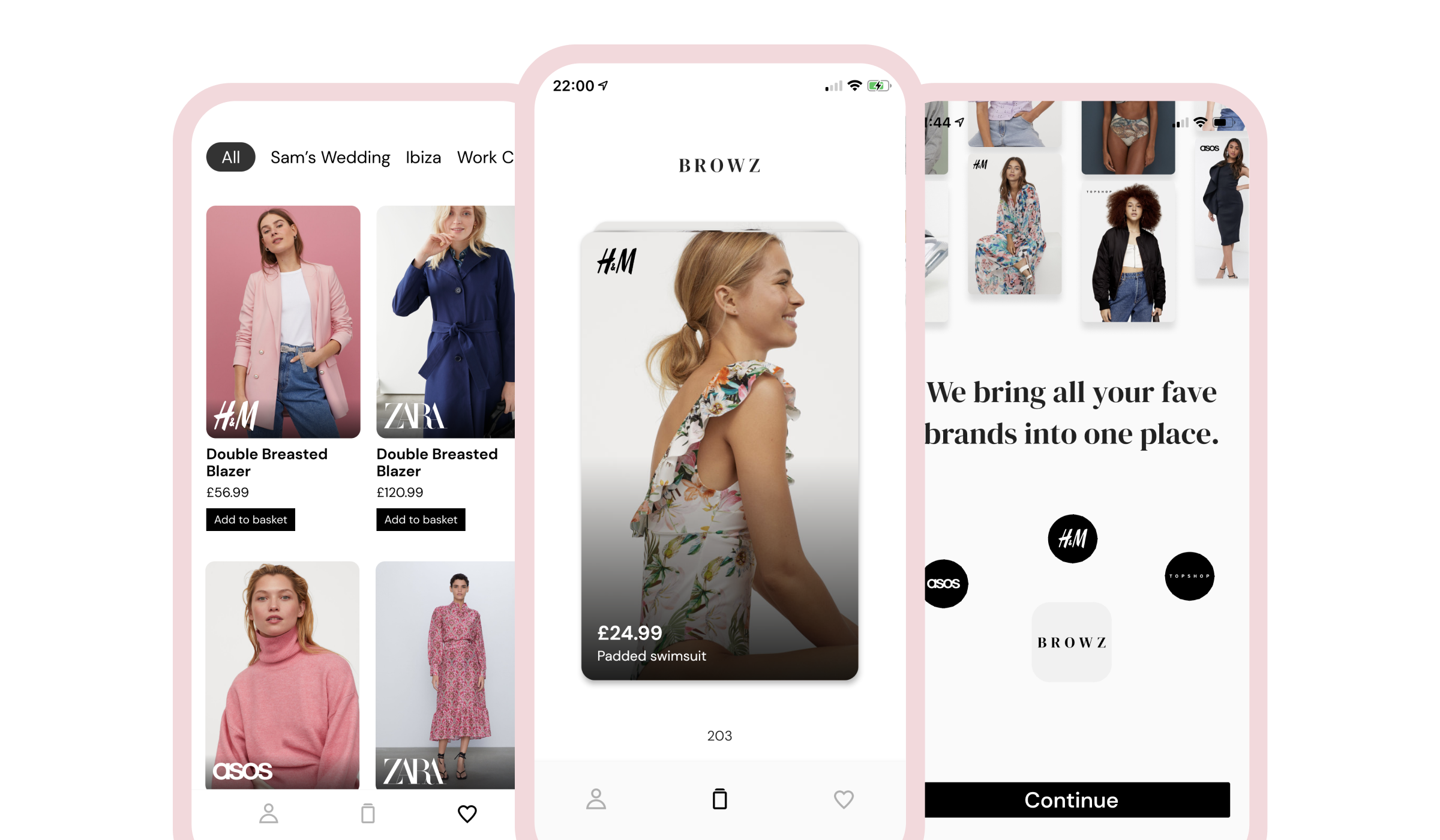
Witnessing my wife kill time by switching between multiple shopping apps ASOS, H&M, Zara etc. gave me an idea. Wouldn’t it be cool to have an app that aggregates all of the new items across multiple brands, so you wouldn’t have to switch between apps all the time.
With this core concept, how could we mimic a typical shopping experience? Wondering around the shops, your brain is constantly making yes/no decisions on clothing items you pass. We wanted to recreate this casual shopping experience by making it really simple to make those yes/no decisions on a delightful user interface.
Role & Duration
Co-founder and Product Designer
Interaction, Visual Design, Brand, Prototyping & Testing
Mar 2020 - Present
The Problem
The core problem was the inconvenience of switching between multiple shopping apps.
With the users’ goal in mind of finding something new across the various shopping apps, it’s time-consuming to see all of the new things that have “just dropped.”
Within the product, we also discovered some early problems based on early user testing.
- People that weren’t familiar with Tinder didn’t know to swipe.
- With no prior knowledge of Browz, would people know that we’re showing them all the new items across multiple brands?
- Users were unsure of which way saved and which way removed it.
Learnings
Having never designed a fashion/shopping product before I took inspiration from other fashion apps, fashion websites and ofc Dribbble.
I landed on a Serif font for headings coupled with a sans-serif font for the body. The pairing I chose worked well as the Serif font gave it a level of sophistication and the sans-serif font gave it legibility at reduced font size.
Not wanting the UI to distract from the items themselves, we went for a base of white with varying high contrast text elements. The images, as they should be, are front and center. Apple recommends a minimum contrast ratio of 4.5:1 and we were definitely able to achieve this here.
The Solution
I believe we’ve crafted an elegant solution that adds real value for the user. We show you all the new things across multiple brands and present the user with a simple workflow. Swipe right if you like it, Swipe left if you don’t. We save all the items you’ve swiped right on so that you can conveniently view these later. We kept the UI neutral and monochrome so the emphasis was placed on the clothes themselves.
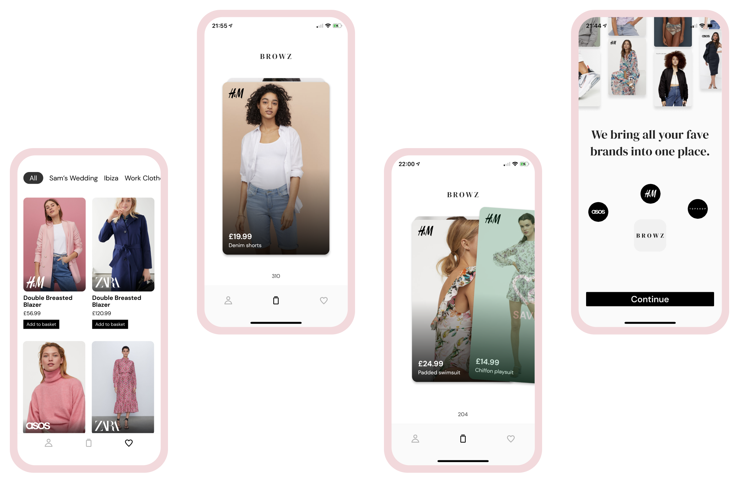
Simple Interaction
Utilizing common design patterns made popular by dating apps, we can recreate the experience of walking past an item in a shop and making a decision on it.
Educate value
We wanted to communicate the value of the app as early as possible. We were able to achieve this in a literal (text) and a visual way through the use of animation.
Inline walkthrough
We got some feedback from non-Tinder users that they weren’t sure what to do. Adding this initial card that both informative and self-educational did a lot of the talking.
Coloured Overlays
For the users unaware you need to swipe right to save and left to reject. We added a subtle overlay on the card which removed any ambiguity.
